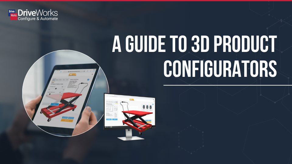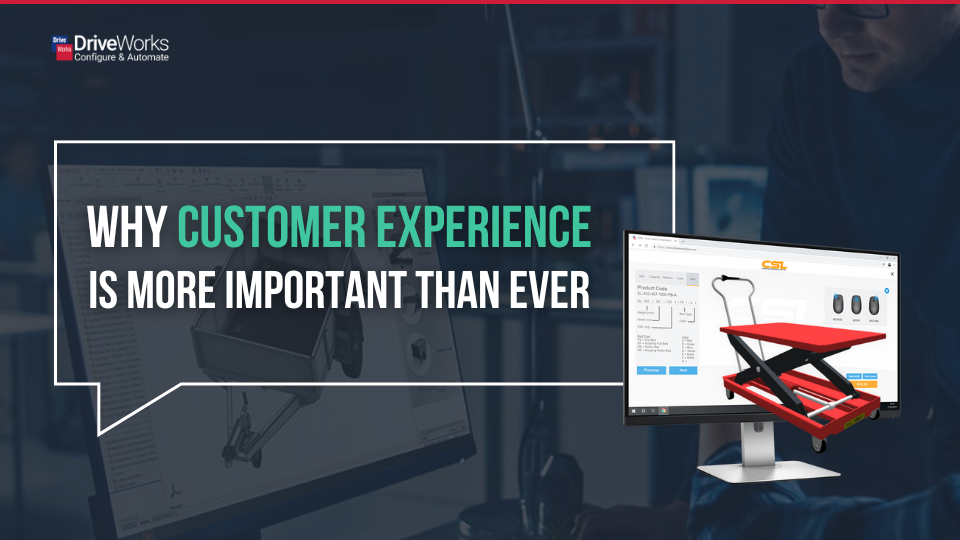
A great configurator does more than just capture customer requirements. It helps users make confident decisions, reduces errors, speeds up the sales process, and creates a positive experience that reflects your brand.
Whether you’re building a customer-facing product configurator or an internal sales tool, user experience (UX) should be a key consideration from the start. A well-designed configurator can speed up onboarding for new users, improve customer satisfaction, reduce mistakes, and increase conversion rates through a smoother quote-to-order process.
Here are our top tips for optimizing configurator user experience.
Top tips for optimizing configurator user experience
- Follow familiar design patterns
- Use guided selling to help users make better decisions
- Create a clear visual hierarchy
- Wireframe before you build
- Take advantage of templates
- Create a clear visual hierarchy
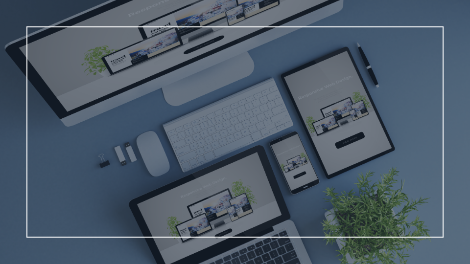
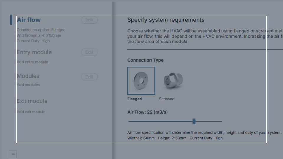
1. Follow familiar design patterns
One of the most important UX principles is Jakob’s Law:
Users spend most of their time using other websites and applications. As a result, they expect your configurator to work similarly to the tools they already know.
Use familiar controls, standard navigation methods, and intuitive layouts wherever possible.
When users instantly understand how to interact with your configurator, they can focus on selecting products rather than learning the interface.
Consistency reduces confusion and shortens the learning curve for new users.
2. Use guided selling to help users make better decisions
The best configurators don’t just present options, they guide users through the decision-making process.
Guided selling can:
- Streamline workflows
- Reduce back-and-forth communication between sales and manufacturing
- Reduce manufacturing errors
- Increase customer satisfaction
- Help users make informed selections faster
Rather than presenting every available option at once, reveal information progressively and guide users through logical choices. This creates a more intuitive experience and reduces the likelihood of invalid selections.
3. Create a clear visual hierarchy
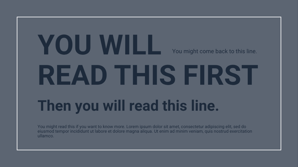
Good visual hierarchy helps users understand what matters most and what action they should take next.
Several design elements can be used to establish hierarchy:
Colour – Use bright or contrasting colours to draw attention to primary actions such as “Next,” “Generate Quote,” or “Submit.”
Size – Larger elements naturally attract more attention and can highlight important information or actions.
Pattern – Repeating layouts and control arrangements helps users understand processes and workflows.
Proximity and White Space – Group related information together and use adequate spacing to reduce information overload. White space can make interfaces easier to scan and understand.
4. Wireframe before you build
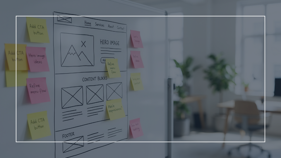
Investing time in planning can save significant redevelopment time later.
Wireframing enables you to:
- Experiment with multiple concepts
- Visualize the final configurator experience
- Share ideas with colleagues and stakeholders
- Test designs with end users
- Identify usability issues early
5. Take advantage of templates
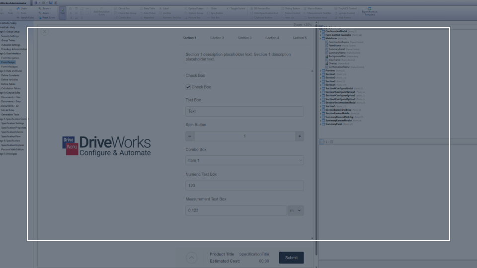
Using templates can speed up development and improve consistency.
Project templates and example configurators can provide:
- Established UX patterns
- Faster project setup
- Inspiration for form structure and navigation
- Tested approaches for common configuration scenarios
The DriveWorks Form Designer makes it easy to create a custom UI that matches your company branding and creates a great user experience.

6. Don’t ignore performance
Performance is a critical part of user experience.
Users expect immediate responses, and long loading times can negatively affect satisfaction and productivity.
Moving background tasks away from user-facing events improves performance. In DriveWorks, when multiple tasks are added to the leave event of a running state, the UI is paused while the tasks complete. This can lead to the user seeing a loading GIF for this time.
Moving the tasks to the leave event of an automatic state means the tasks are run by DriveWorks Autopilot and do not impact the UI.
Want to learn more?